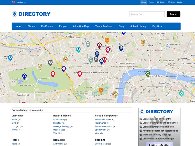
The design of the Directory WordPress theme is fully responsive and performs very well in any device. Be it a mobile phone or a tablet or a laptop , the directory theme will give a consistent view in all the screen resolutions.
Basically all the mobile phones come with different screen resolutions. A great content and beautiful design means nothing if it’s display is inconsistent and inefficiently in these devices.
What is the necessity of a responsive design?
Majority of the people use the mobile phones and other devices like an ipad to access the internet. When a website is not responsive and shows messed up view on the different d devices all these people are disappointed.
When creating a website, the main thing to be taken care of is the ease of the users while accessing it. Therefore, being responsive for a website is a prime requirement to enhance its performance and user experience.

A responsive design increases the traffic by letting the users access the site from mobile devices too. It enhances user experience and allows them flexibility.
Use
Suppose a person sees a glimpse of your website while working on his computer, but being busy he’s unable to visit it and view it. Now, in his leisure time, when he desires to come back to site, he won’t have to open the computer to view the site. If your website is responsive, he can check the website from his phone anytime, anywhere, without missing a detail.
