
A contact form is perhaps the most common and one of the most useful elements of a website.
Whether it is a simple contact form to just get the contact information of a visitor, or a complex form to gather more personal or professional information, a contact form is a must.
When you have a website on the internet, representing your business online, there must be a way for your visitors to easily get in touch with you.
This is what contact form helps you do. So, if you are setting up a contact form on your website, here are some tips on how to create an effective contact form.
Location of the contact form
The performance of your website and conversations depend very much on the arrangement of the screen elements. So, where you place the contact form on your website also plays an important part.
For a simple business website without advanced registering and online processing features, the contact form is the easiest way to let the visitors contact you.
It is in fact, a form of conversion machine for a simple business website. But it won’t work until it is easy to find.
It is advisable to choose a smart location for the contact forms on your website. There’s no ideal location since different types of websites have different requirements.
Easy to understand
To make sure that the contact form is easy to use there are certain things you can do. First of all, take care of the field labels.
You should also provide useful examples as and when required. So a new visitor can understand and put in the right data. Validation rules also help visitors identify if they are trying to key in the wrong information.
Proper validations
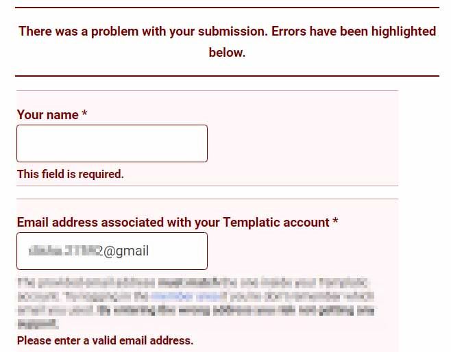
To fetch the right information from the visitors through the contact forms, you will need proper validations. This will stop the visitors from entering the wrong information through the forms.
You can also use proper prompt alerts to suggest when the form is submitted successfully or is unsuccessfully, or if there is an error in input by the users.
Go Multi-step only if required
There are different forms of builders that let you create different types of web forms. For complex data collection, you may want to rely on multi-step forms.
These are the comparatively complex forms and involves logical flow directions. They should only be used when absolutely necessary
Avoid unnecessary complications
When it comes to contact forms, less is more. Always try to make it as simple as possible. You can do the following to create simpler contact forms:
- Remove the unnecessary fields
- Use self-explanatory titles
- Avoid multi-steps whenever required
Respond regularly (use auto-responders)
The key is to keep your visitors well informed with information. When the visitors use the contact form to reach out, they expect you to respond to them as soon as possible.
Initially, when you don’t have a high number of queries, it will be easy to respond regularly. But once the contact form is frequently used and generates a greater number of requests to be handled in a day, you can hire someone to handle them.
You can even use the auto-responding messages to inform the visitors that their query will be processed and they can expect to listen back soon.
Group content fields
We recommend using a simple and small contact form on your website. But for some reason, if you are using a long-form on your website, make it simple by using grouped fields.
For example:
A form to collect the data about a person, there can be a group of fields for personal information like name, age, gender, birth date, etc. On the other hand, there can be other fields related to the academics of a person. Here, you can go for grouped fields for all the education-related data.
This helps to make your contact form more organized and the visitors can easily understand them.
Highlight the buttons
There will be at least one button on the contact form – “The Submit button”. There can be more but the submit button is obviously the most important button on your website.
You should highlight it properly for better accessibility. A button can be designed efficiently so as to capture the visitor’s attention quickly. A properly highlighted button can help you draw the visitor’s attention to the contact form.
Don’t ask for too much information
You should only ask for the information that the visitors would like to share with you. And only the information that is certainly required.
Collecting information that is of little to no use for your purpose should be totally avoided. It is a waste of time and energy on both ends.
Therefore, whenever deciding the fields for your contact form, you must first contemplate if the fields you have finalized are absolutely necessary or not.
Use appropriate field types
The key is to make your contact form simple, not boring. Using different field types makes the contact form easier to use.
The visitors can get the form filled and submitted quickly, as such using appropriate fields saves their time. For example: For the gender question, you can use a radio button because there can be one right answer from the given choices. For some other field depending on the user’s choice, you can use a radio button.
Therefore, using proper fields makes your contact form more meaningful.
Conclusion
Using appropriate and efficient contact forms on your website has more advantages than you can think of.
However, you can only find out what works best for you by experience and the trial and error method.
When it comes to website building, only experimenting and experience can help you know – what to improve and how to improve it.