Today’s article walks you through how to optimize WordPress sites for mobile devices. In several earlier articles we wrote about how the use of mobile devices has experienced a complete expansion over the past few years. Some studies show that more than 50 percent of all internet traffic and website visitors were using mobile devices. Therefore you can no longer ask yourself whether your website should be optimized for mobile devices or not – it’s an absolute must now.
If you properly optimize your WordPress website for mobile devices, you will greatly improve the user experience and ranking of your website on internet search engines. Optimizing your WordPress site for mobile devices consists of several steps. Below we will list them and explain each of them.
1. Use a responsive WordPress theme
The first and best step you should take is to choose a WordPress theme that will adapt to mobile devices. In this way you will ensure that your website is displayed perfectly regardless of whether your visitor uses a PC, mobile phone, tablet or any other device.
You will find that the WordPress repository has many WordPress themes that adapt to screen sizes. Of course, there are also paid themes that you can use. Be sure to test the appearance on devices on different screen sizes after installing any theme. Only in this way can you be sure that your website is displays correctly to all your visitors, no matter what device they are using.
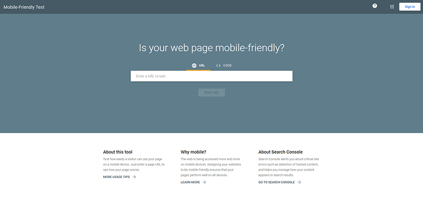
There are also a number of tools that will help you test if your site is displaying correctly on different devices. One of the most famous and popular tools is the Google Mobile Friendly test.
2. Use a caching plugin
Using a caching plugin is very important for your website’s loading speed on desktop as well as mobile devices. In principle, mobile phones, tablets and other similar devices generally have a slower connection than standard desktop computers or laptops. For this reason a caching plugin is very important to speed things up for visits from mobiles or tablets. A cache plugin will store static parts of your pages on your visitor’s device. This means that when visiting your pages again, the content will not be reloaded from your hosting server, thus loading the website pages will be executed much faster.
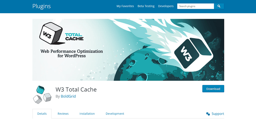
There are many quality caching plugins. Our favorite is W3 Total cache. This fantastic plugin offers multiple caching options, it is very easy to use, provides advanced caching options such as minification, CDN integration and many other options. The good news is that this plugin is completely free to use.
All WordPress caching plugins work on the same principle. It’s really up to you to try which one is easiest for you to manage and decide whether you want to pay or use a free one. Basically, whichever caching plugin you choose, you won’t go wrong.
3. Optimize images and other content
Large and unnecessarily high resolution images can make your website load much slower. Imagine having only two large images on your home page. Loading of the images alone might need 10,20 or 30 seconds or more. This is especially a huge problem on mobile devices. This is why it is very important to optimize images and other content on every page on your website. There are many quality services that will optimize images and reduce their size without any visible loss of quality.
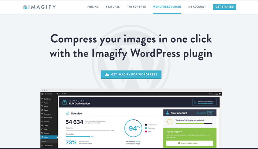
One of the best image optimization services is Imagify. This is an excellent tool that has a WordPress plugin which will help you to optimize all images with just one click. If you want to try this tool, there is a free plan where you can optimize up to 20MB of images in one month. You can also find plenty of websites online that let you optimize images for free if you prefer.
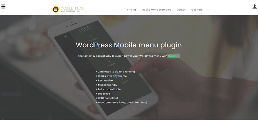
4. Use the mobile menu plugin
As you know, screens in small devices are offer limited space and this makes it necessary to optimize the menu so it displays nicely. Most free and commercial WordPress themes already have an integrated solution for the mobile menu. However, if you have a theme that you like but does not have a good menu layout on mobile devices, then you can install one of the plugins built for this purpose.
One of the best and fastest plugins for this purpose is the WP Mobile Menu plugin. This is a commercial plugin, but it’s worth paying for because it has a lot of predefined menu templates that you can use. Its advantage over other plugins is that you can disable it in specific pages, you can define a menu only for logged-in users, create alternative menus per page, create footer menu and many more useful options.
5. Improve the readability of your site
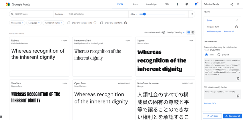
Any web page will be readable on large screens. However, this is not the case if your visitor is coming from a mobile phone. The page may be unreadable to him and of course he will leave it immediately. You will solve this problem by using responsive fonts. There are many quality fonts that will change their size in relation to the size of the screen.
One of the best sources of responsive fonts is Google Fonts. You can find a lot of great responsive fonts that will fit perfectly into any website.
6. Optimization of ads and pop-up windows
Arguably, displaying advertisements on your website is one way to monetize your content. However, if your ads and pop-ups are not optimized for small screens then it can result in your website being abandoned. It often happens that a pop-up or advertisement occupies the entire screen on a mobile phone, and for this reason the visitor closes the entire website.
To avoid this problem, make sure your ads and pop-ups are optimized for mobile devices.
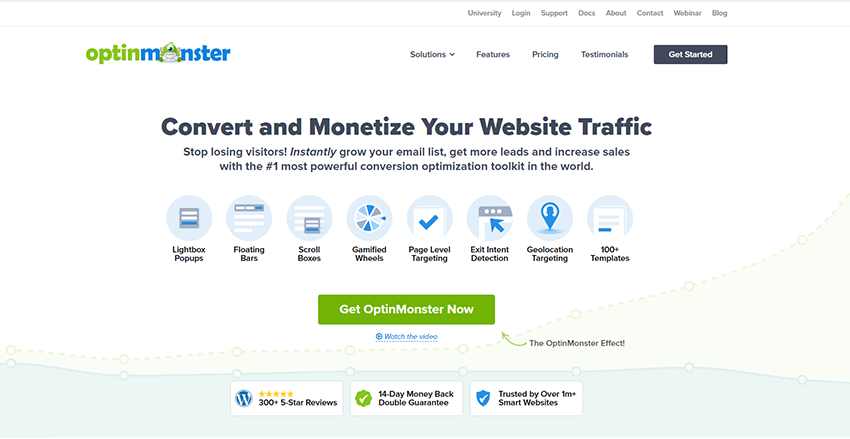
There are many services that offer the possibility of creating pop-ups and advertisements, which are adapted to mobile devices. One of the best and most famous tools is OptinMonster.
This is a commercial tool used by more than a million websites to turn their traffic into subscribers, leads and sales.
7. Adapt your forms to mobile devices
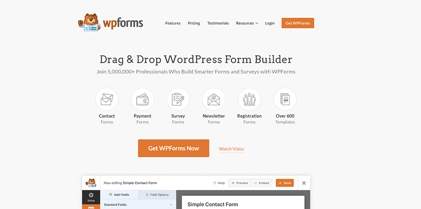
There is almost no WordPress website that does not use at least one type of form. The most used are the contact forms that we all have on our websites. Just like other content, contact forms must be adapted to each screen size.
There are many tools that will prevent your fields from being small and your buttons from being barely visible. One of the best contact form plugins is WPForms which will allow you to create any form adapted to any screen size. The advantage of this plugin is that it has many predefined templates that will satisfy even the most demanding users and will fit into absolutely any design.
8. Install AMP
This is a great way to speed up the loading of your websites on mobile devices. This project was developed by Google and works on the principle of loading a reduced version of your website, which is why it loads faster.
There are many WordPress AMP plugins, and one of the most famous is AMP and can be found on the WordPress repository.
9. Consider using a CDN
Using a CDN is a great way to speed up the loading of your website. CDN, or content delivery network, is a service that delivers the content of your website to users from the server that is geographically closest to them at that moment. In this way information will reach their devices faster, and therefore the website will load much faster.
One of the most famous CDN services is CloudFlare. This service also offers a free plan. If your website is popular and has a large number of downloads, then you will have to consider purchasing one of the membership packages.
10. Do not host multimedia content
Due to large file sizes, multimedia content can make your website load much slower. That is why it is necessary to keep that content within normal limits and not use it a lot. If your website uses videos within articles, use some video platforms like YouTube and keep the video files on their servers, and just embed them in your website, pages or articles. In this way, when a visitor watches a video on your website, it consumes the resources of another platform, and your website loads quickly.
Conclusion on how optimize WordPress sites for mobile devices
Given that today most visitors come to websites from their mobile phones, you should be aware of how important it is that your website is adapted to all screen sizes. Sometimes it’s not enough to just install a responsive theme and think the job is done. To create a website that is fully adapted to mobile devices, go through all 10 steps that we have listed in this article. Finally, when you’re done, be sure to test your website from different devices and test it with the Google Mobile Friendly tool to make sure you’ve completed the task correctly.
Best WordPress Caching Plugins In 2024