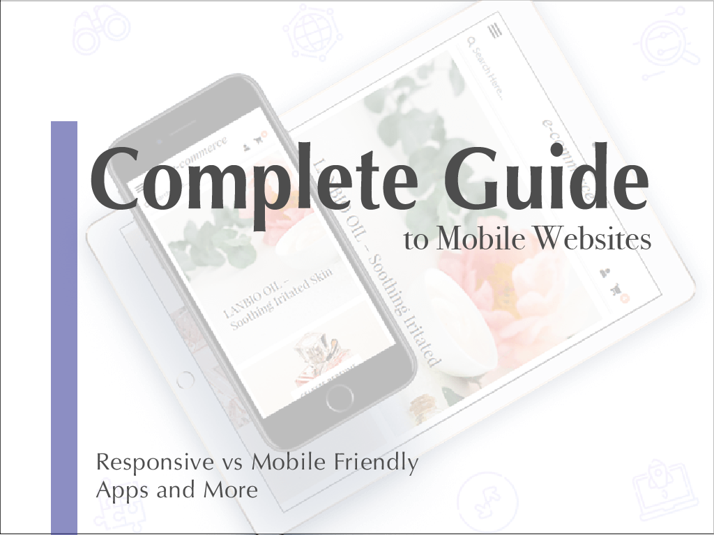
The mobility of your website equals the amount of reach and traffic you can acquire.
I mean how much do you use your phone to look things up? Its just easier, and sometimes faster to just look it up on your phone.
Its also nice when you do look up a website it works smoothly and is easy to access.
But, knowing the difference in what mobile friendly and such means, can help you determine which is right for you.
Why Go Mobile?
Ever-Expanding Digital Market:
It is no secret that more and more people are using smartphones and tablets to access websites, pay, and gather information.
In 2018, 52.2% of all website traffic worldwide was generated through mobile phones.
And this will only continue to increase in 2019 and on.
It would be in anyone’s interest to hop on the mobile version train within this year and even more important to increase user experience for on-the-go website traffic.
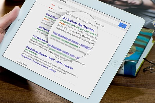
Google’s Mobile-First Indexing
Google recently integrated more forward motion for mobile first indexing in search results and data. The data given is different depending on the device the user is on.
Placements in search results are now completely dependent on the performance of the website on mobile devices.
Google will actually penalize non-mobile friendly websites in search rankings.
Which means, to help search results in your favor than it is important to also have a mobile presence, this can boost SEO from either direction.
Next Steps
So you know you want a mobile version for your website, what now?
Well, there are different options to make your website integrated into a mobile version. Some of them can be more expensive than others if you are finding a designer to do it for you.
If you are looking into WordPress Themes, many of them have options for integrating into mobile version.
Know What You’re Getting
Many companies will say they are mobile-friendly and many people believe they are getting a responsive website, but in reality they aren’t.
Knowing the difference is key to knowing what you are actually paying for, and how to optimize profits, user experience, and readability.
Or maybe you already have a mobile-friendly website and are looking for ways to take it to the next step for your visitors.
Let’s go through all the mobile version options:

Mobile-Friendly:
Basically, mobile-friendly has the least amount of work to set-up.
This is basically just the shrunken down version of your website, which will accurately display on mobile, tablets, and of course desktop/computers.
Mobile-friendly looks exactly the same just smaller.
Many websites now-a-days are mobile friendly, and still pose a hassle for the users.
It is not designed to improve the experience, and even though everything works the same, users have to scroll and zoom to find what they are looking for.
Features that will help:
- No flash support
- Small image size which will help with loading speed
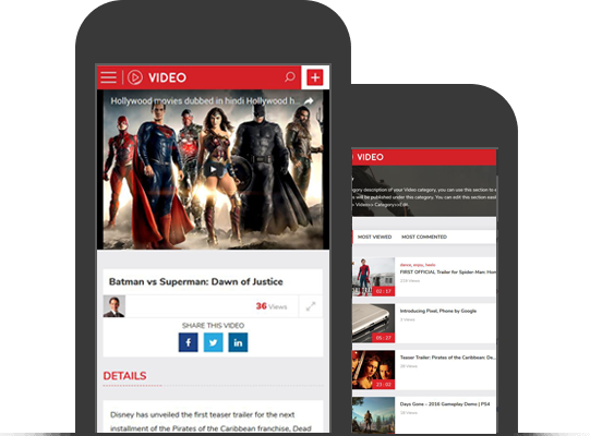
Mobile Optimized:
This version is more advanced than the mobile-friendly but less than responsive.
The main difference you will see with optimized vs responsive is optimized is only for mobile phones and responsive is for ANY screen size.
Mobile-optimized is a reformatted web-page that is more efficient for mobile users, and puts the experience and thought behind the design.
Features will include:
- Larger images so its easier to see on smaller devices, with adjusted text
- Easier navigation with larger buttons so this becomes thumb-friendly.
- Each reformat is designed to help scrolling make more sense, and make for easier on-the-go
- As always its a good idea to optimize images for faster loading
- Large touch points
- Avoid typing options
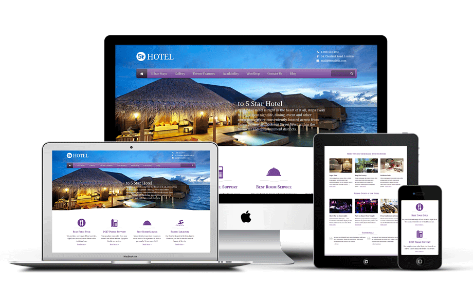
Mobile Responsive:
As mentioned before, the biggest difference with responsive it has an adjusted layout perfect for any screen size, making it completely flexible.
This is great to be accessed on any device without worrying, since more people are also using tablets.
Mobile responsive, as opposed to mobile-friendly, is guaranteed to have complete functionality, and efficient look, not just be a squeezed version of your website.
It will come with all the same features as mobile-optimized just not specifically for mobile devices.
You can always test out a website by adjusting the edge to see how responsive it is.
This is the reliable solution for any business that wants to expand past the computer screen, and have on the go purchases. Its also great for other businesses like blogs, news, or directory sites.
This is the most popular extension of a mobile-friendly website due to the maximized reach it has and the ultimate user experience that is not a mobile app.
- Larger images so its easier to see on smaller devices, with adjusted text
- Easier navigation with larger buttons so this becomes thumb-friendly.
- Each reformat is designed to help scrolling make more sense, and make for easier on-the-go
- Large touch points
- Avoid typing options
Mobile Apps:
We spend 90% of media time on mobile devices in apps and 10% on the mobile web.
So it makes sense to have an app for your website to take advantage of 90% of mobile use. This can also be beneficial to monetize your business with app downloads.
Mobile apps are customized operating systems for devices, which can have unique brand designs and individual experiences.
They can have more functionality with customized features and tools specifically built for the devices.
Speed can be faster with better loading times since it is integrated into the device.
Native Mobile App:
Designed for specific mobile operating system, such as Apple device, this is great because it will run without error but can only run on one operating system.
Hybrid Mobile App:
Designed to operate on multiple platforms, with a single standard code, but the costs might be higher.
Conclusion
When deciding what is best for your website, always do research to make sure you are getting exactly what you want. Its suggested to go fully mobile responsive to avoid any issues and to have the most potential reach as possible. Mobile apps are great, if possible, for the future of your website.